ThinkBank (BMO) new customer onboarding
Empowering international students starting their financial journey in Canada with ThinkBank
Design Challenge: Assist International students navigate Canadian banking while driving sales by opening chequing accounts with ThinkBank
Industry: Finance, Banking
Platform: Responsive Web
Project duration: 4 Days (Design Sprint)
Project Overview
In collaboration with BMO x Brainstation, our team was assigned a 4 day sprint to design a microsite for international students to Canada opening chequing accounts with ThinkBank.
Main Goal: Introduce newcomers to Think Banks financial products to drive increase in online sales.
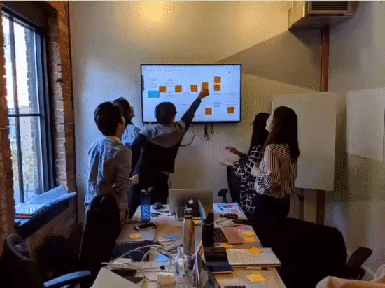
Sprint process:
Day 1: Map the problem
Day 2: Sketch & Decide
Day 3: Prototype
Day 4: Test
Day 5: Present
Day 1: Empathizing with Students Coming to Canada
We first began with what we believe students would even want to look for when coming to Canada and what deciding factors would guide a students decision making when choosing their bank.
Secondary Research:
According to research conducted by LivePerson, Gen Z, the younger generation is spending more time communicating through digital communication platform - more than their offline interactions.
Gen Z are also expecting a more immediate answer via an online self-service app, as opposed to a personalized one-on-one customer service.
Primary Research :
To best understand a student's journey we also conducted primary research with 5 previous international students on their experiences choosing their bank.
Overlapping Interview insights:
Convenience within their day to day life.
Language barriers
Learning Canada's banking system is different from their home country banking system, and how to navigate and understand it
Finding support from financial advisers
Design Exploration
Persona / Journey Map & Story boarding:
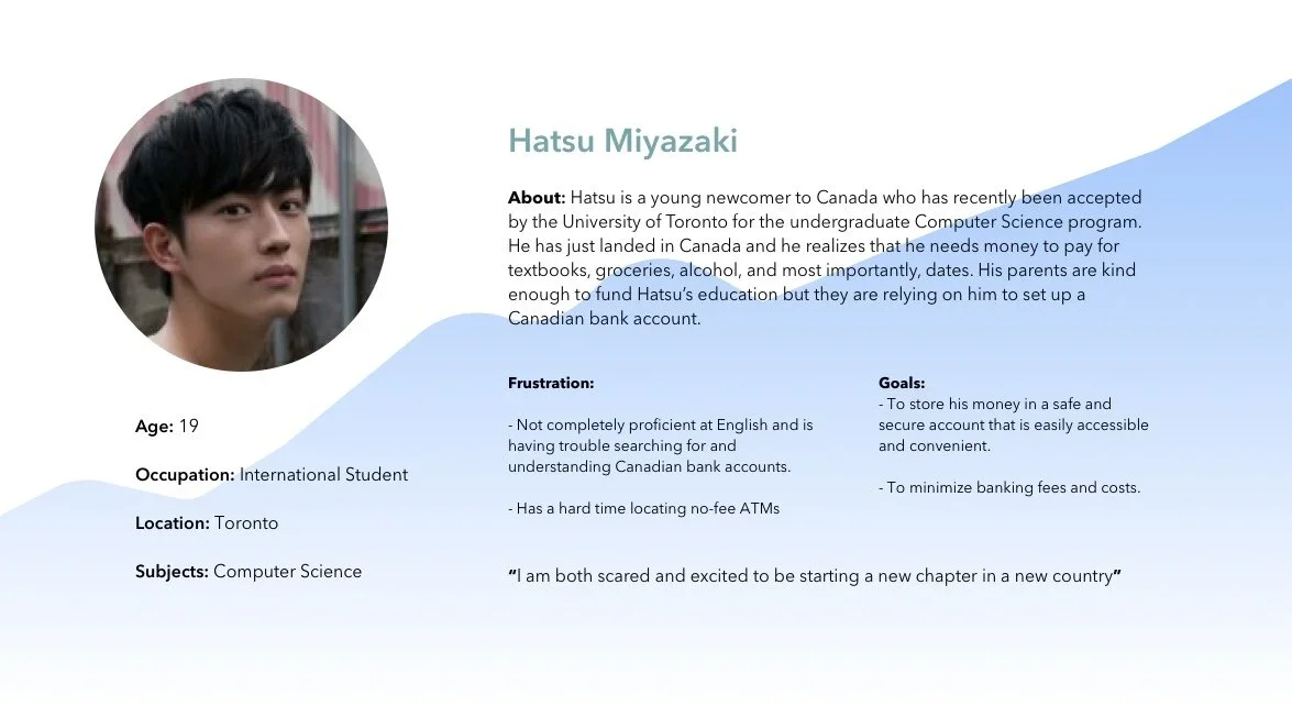
We then created the persona Hatsu to guide our design decisions, and which areas would aid in his decision making, when choosing a bank.
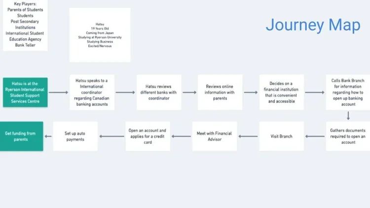
Which brought us how might we provide more effective assistance to international students trying to open a Canadian bank account?
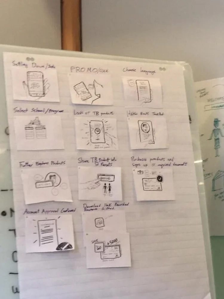
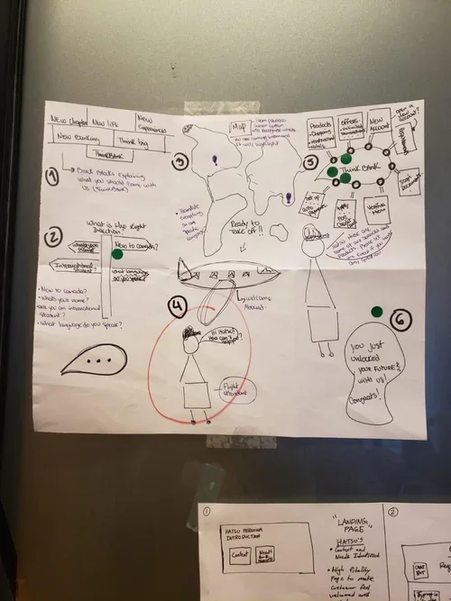
Day 2: Sketch + Decide
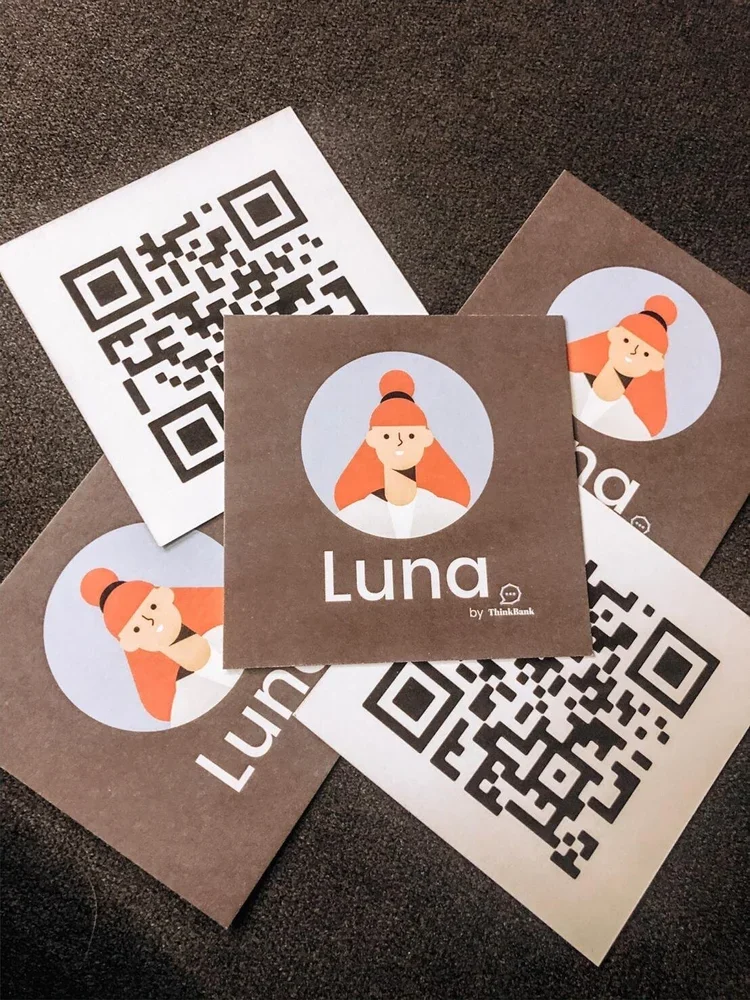
Our chosen solution:
Our ideation led to a responsive microsite powered by a virtual assistant, Luna, to solve for the steep learning curve of Canadian banking.
The Insight: Banking "mental models" vary globally (e.g., no monthly fees in India; no credit scores in Japan).
The Solution: We chose a VA over static text to mitigate language barriers and "information overload," providing real-time translation of complex financial lingo into actionable steps.
Day 3: Prototyping
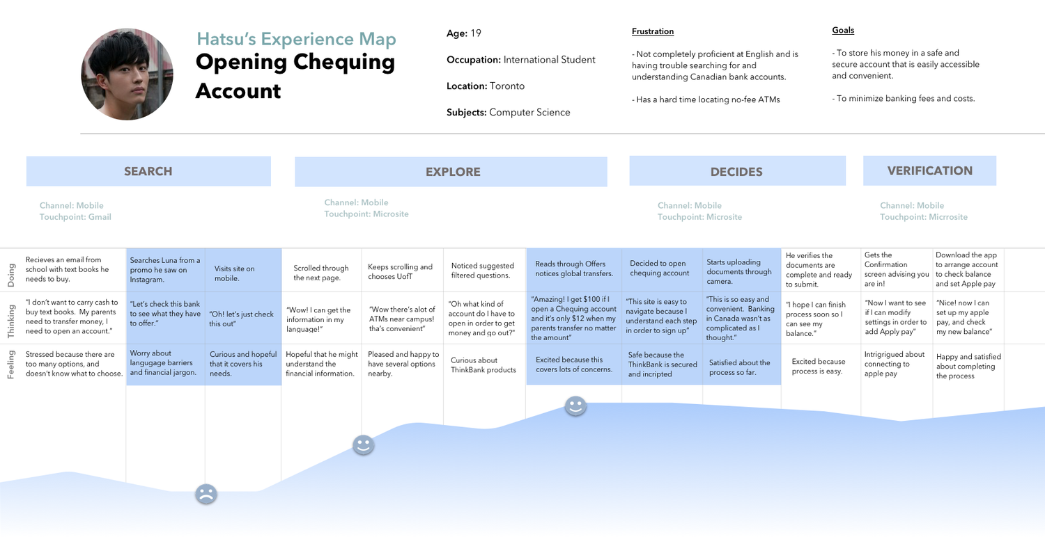
Keeping international students like Hatsu in mind, we based our design decisions around his motivations and needs to make Canadian banking easier.
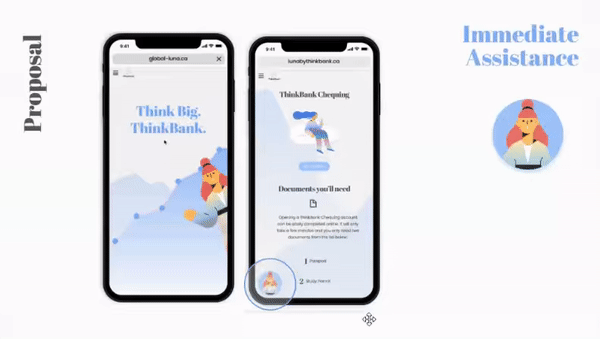
Immediate Assistance via Luna
Always-On Support: A persistent UI entry point for real-time guidance.
Contextual Education: Simplifies complex topics (e.g., the value of local branches/ATMs) via interactive FAQs.
User Sentiment: Bridges the gap between foreign banking "mental models" and Canadian reality through a conversational, welcoming interface.
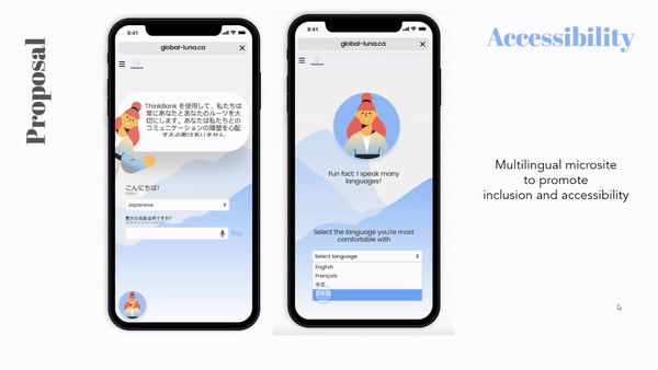
Removing Barriers through Language Customization
The Challenge: Technical banking terminology is often inaccessible to non-native speakers.
The Solution: A localized, responsive experience that allows users like Hatsu to toggle to their primary language, ensuring full comprehension and confidence during onboarding.
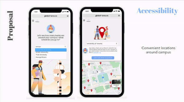
Proximity-Based Discovery
The Insight: Convenience is the #1 acquisition lever for students.
The Solution: A school-indexed location finder.
The Result: Users like Hatsu can instantly verify physical accessibility, reducing the friction of choosing a bank that fits their commute and campus life.
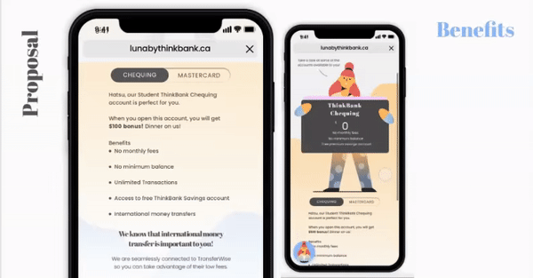
Benefit-Driven Conversion
The Goal: Clearly communicate why ThinkBank is the right choice for international students.
The Solution: A benefit-first UI that anchors ThinkBank’s value (convenience and accessibility) to a direct path for product exploration
The Result: Users can move from "Viewing Locations" to "Product Details" in a single, informed tap.
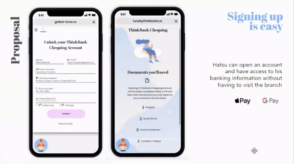
Mobile-First Document Capture
The Challenge: Traditional banking requires physical paperwork and branch visits, which are daunting for new arrivals.
The Solution: An integrated document upload flow with real-time guidance.
The Result: Users like Hatsu can securely submit IDs from their phone, accelerating the time-to-account-opening.
Day 4: User Testing & Findings
Due to the time crunch of Sprints we managed to conduct 5 user tests for the microsite, and the feedback was as followed:
Immediate Assistance
User Testing: We found our users enjoyed having a friendly avatar act as a guide throughout their journey. The illustration felt familiar, and it made opening an account feel casual and less tedious as it normally would be when visiting a branch.
Multilingual
User Testing : We found that our users really enjoyed the multilingual microsite to cater to their language needs. Users felt welcomed and accepted.
Next Steps:
In order to increase the level of security for our users, we would like to work with a 3rd party company, Jumio, that focuses on validating ID and documents.
Be part of a 3rd party where we can increase security measurements
Integration with banks from home country
Expanding guidance in other financial areas such as: Building credit, mortgages, loans, etc.
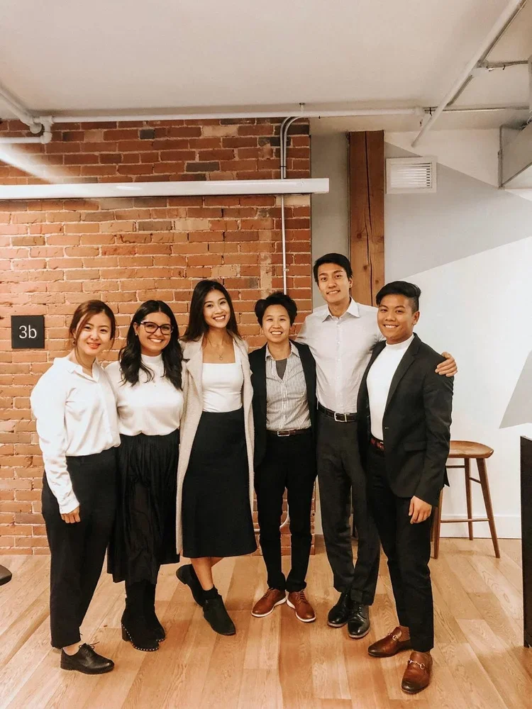
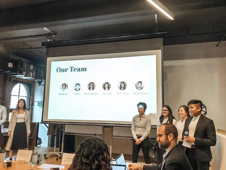
Bonus: Meet the team!